A tour of the evidence, from the 1780 origin of the greenhouse effect through its the major post-WWII acceleration
A preprint of a pending journal article of the same name is here. It’s a fairly short but thorough study, a data story, using the climate science we all know, to trace how humans have long organized our use of the earth to maximize the growth rate of our economic intervention in the climate. That exposes the fatal flaw of nearly all promoted solutions, the boundless plan for doubling our total energy use about every 33 years. Every kind of energy use for replacing fossil fuels would still then need to repeatedly double its disruption of earth systems, overshooting all planetary limits. That was actually the problem with fossil fuels, that if we had stabilized our energy use by about 1960 we would not have exceeded the earth’s long term buffering capacity and there would have been no climate crisis.
In the following figure you can see it quite directly from the long periods of constant compound growth in atmospheric CO2, before WWII and after. The ancient CO2 data comes from from ice-core air samples, until 1958, and the modern data from mountain top air sampling after that. WWII is seen as halting the accumulation of CO2, and the period after when we globally reorganized the economy using advanced science, technology, institutional and government cooperation to maximize the economy’s exponential rate of expansion.
What this implies is that climate change is not really caused by CO2.
Rather the climate crisis is being driven by our constant haste to reorganize the economy again and again to expand its conversion of resources into dollars as fast as possible. That we are not changing that organizational design of the economy would then seem to be the reason we are unsuccessful in getting agreement on how to reduce the quantitative reductions in CO2.
What is needed is to include in the economy’s equation for profits the value of the material, ecological, environmental, and cultural resources of the earth. The trick is to start with what you can measure, make the units “shares of the total,” and work to measure more. That would lead to a fuzzy but holistic and complete map of where we are really going economically. For reference, a model for that was proposed for inclusion in the UN’s SDGs in 2014, called “the World SDG.”
Blurb: The leading sciences offer a pattern language for nature in the form of interrelated mathematical equations. Scientifically undefined natural language remains needed for referring to and discussing the rich self-defined patterns of organization found in nature and discovering their roles in our lives. Those include general multi-scale patterns of ‘cellular organization,’ ‘mediums,’ ‘homes,’ ‘growth,’ and ‘cultures,’ and are among the guiding patterns of naturally occurring design this pair of revised 2015 papers explore.
The author’s effort is to bring together her long studied natural science pattern language of emergent organizational growth and climax transformations with Christopher Alexander’s pattern language of holistic architectural design, to be a resource for a combined design-science point of view. The discussion does not rely on a detailed study of either precedent. It relies instead on the reader’s own experience with and ability to recognize naturally occurring patterns of design. The text is arranged as a series of short essays, combining introductory and advanced issues, that one may read through or pick up to read and reread a piece at a time.
Vita: – BS in physics – St. Lawrence Univ., post-graduate math courses – Stony Brook & Columbia, architecture & landscape design MFA – Univ. of PA. A mix of rich experience and field study of energetic patterns of organization in emergent microclimate & other growth systems, showing how after growth the vitality of systems is sustained to make life so lively.
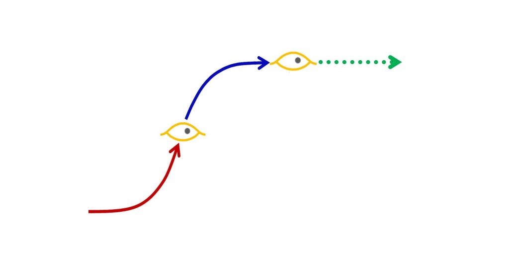
…. One of the more curious things about nature is how obvious it is that every natural design develops by its own individual growth process, building up from an initial design pattern and emerging as a whole as it runs its course. That applies to a storm, a volcanic eruption, a lightning strike. It also applies to smaller scale life systems, such as for personal relationships or conversations, human or other plant or animal lives, civilizations, ecologies, and of course businesses and economies. The living systems for which growth is a holistic building process, preparing them for long lives after growth, all start by organizing and expanding faster and faster at first, and then shift gears to develop slower and slower, refining and coordinating their designs to climax when ready to begin their long lives ahead. It’s a switch from scaling up the starting patterns to then take a sustaining role their environment.
… If that understanding, of how to succeed in life after growth, were to spread around the world, it could dramatically change our now doubtful future. Today our chances are compromised by our global inability to stop our ever growing our consumption, disruption, and confusion of life on earth, not knowing how to smoothly switch from the red to the blue curve, to get ready for a long life.
The natural arc of successful life stories, 1) building, 2) refining, 3) life. the universal pattern of: Innovation – Refinement – Enjoyment
“California suffers greatly because the best elements of the population fail to cooperate for the common good as effectively as the bad elements cooperate for evil purposes.”
He then goes on to eloquently advocate and express confidence in the higher purposes of American society to heal our troubled world, to bring peace and justice to the world. But life is not a simple contest of good and evil. That’s a simple problem to solve, just let people join the side doing good.
What seems mistaken is portraying the evil of the world as being an absence of people doing good. As with the German holocaust of the 1930s and 40s. It is historically common for people who feel themselves to be doing good to then lose control of their societies, not realizing till much later they were doing great evil. In authoritarian societies, the leader commonly appears misled by the results of using their power to multiply their power, unaware of how very societally destructive their own behavior will become. That mechanism also applies to investors and governments now using wealth to multiply wealth, unaware of how destructive to the earth that will become. For the people in the societies doing the growing harm, like ours, “life seems normal”.
The larger difficulty is a “problem of normality”.
It’s almost too offensive for people to consider that their own good intentions and their own good feelings of cooperation in working together for the common good could be susceptible to evil. Examples of societies acting in complete contradiction to their own cultural values, and people having their good intentions twisted to evil purposes, seem like they must apply to “someone else”.
The author of the 2006 paper,Emergence and Evil, in the systems science journal E: CO, nicely documents in intimate detail how teams of good scientists, while living very normal academic & professional lives, also devoted their talents to making smallpox more contagious than it naturally is, for use as an efficient weapon. That is a hideously evil thing to do. The Soviet biological weapons program is also well studied from other views, usually addressing it from the simplistic “good v. evil” perspective. The real problem was good AND evil, a true evil that is not so simple, one taking the reader inside what true evil is. You find how very “normal” it is and how “good as evil” is the real problem behind people cooperating socially for evil purposes, like destroying the earth.
Working energetically for what we hate
That your social relations within a society “can feel good” while your labors are “doing evil” is the problem.
There’s some kind of “disconnect” between what makes us feel good about our work, that fools us about the nature of what our societies are doing as a whole are doing with it. As soon as you realize the nature of the relation, it’s fairly obvious why it’s a problem. It’s that the cells of an organism have a completely different environment from the body, and as cells of the human body, people are rather unobservant. That seems to be the “disconnect.” The cells of a body have their common genome that helps guide each one to act in the interest of the whole, but for quite a number of reasons, our social lives don’t have that for our societal lives.
Without thinking we use natural growth for many common tasks already, simply by starting things to finishing them with a minimum of waste. In each case you “save the world” from needless excess consumptive growth in getting things started, wasting your efforts and the earth’s other natural and human resources.
Every kind of life, and kind of effort too, begins with building up a system of demands for available resources, to further expand on what built up before.
That expansion by building on what was built is the universal start-up process of nature, also sometimes called “extractive growth.” You see it very clearly in every kind of start-up, of a new friendship, a business, a career, a seedling or a life from a fertilized egg. The all start with steps that build up from what was built before. The build up that making breakfast starts with, for example, begins with the idea of food that makes you hungry, that then gets you to reach into the cupboard, and refrigerator for supplies, and the drawer or shelf for utensils, building a customized system and supplies for making your meal.
Nature’s integral; chaining start-up growth & refinement growth in preparing for a good life.
That process could go wrong, the way mankind’s way of using technology to multiply our making of things on earth exploded, and we now don’t seem to know how to stop. In making breakfast it might similarly go wrong if you got carried away taking out provisions. You might start with a small idea of what you need from the fridge, and add to that bigger ideas as you explore what there is to take out, repeating it to exhaustion perhaps, till the fridge and cupboards, pantry, and cellar, are emptied and all the family’s provisions in reach are mounded on the kitchen and dining-area floor, as you get hungrier and hungrier and your eyes expand way beyond the limit of your stomach, putting nearly all the family’s provisions to waste. The particular outcome is rare, but it is very true that once you get going with growing a process of growing, the process itself can become addictive. Today we clearly see in how we are wasting the earth in somewhat the same way, and love to be moved to tears and laughter by watching Disney’s Fantasia when Mickey Mouse learns turn his chores over to his broom with a magic spell, which gets tragically carried away carrying water.
starting things to finish them with a minimum of waste
Of course, we don’t usually behave that way at all, but at some point near the beginning of taking out provisions to use, switch to thinking about how to get to end of having a satisfying meal. We almost never have the exact end in mind either, but perhaps initially take out eggs and cheese to perhaps put them back and take out bread for toast and milk for cereal if you’re in a hurry. As you put things together you also do various smaller and smaller things you discover to do, to perfect the end result while also arranging the timing to get all the parts to come together at once, with excess provisions put away, all part of getting ready to sit down, perhaps with together with others in the family.
In doing that, rather than letting the initial provisioning of breakfast get carried away, we have “USED NATURAL GROWTH TO SAVE THE WORLD,” most often without really realizing what an enormous contribution to the community and your family was done by simply not maximizing the waste of all available provisions in the process of making breakfast. Of course, it’s also important to do and to watch for in other circumstances, a natural duty for living in a commons.
It seems like a little thing but is actually a very big thing, that we casually do for ourselves and others many times every day
that we casually do for ourselves and others many times every day
People are plenty smart enough to see that this “RULE OF NATURAL GROWTH” (also called “nature’s integral“), to finish up what you’ve started up doing before you make a mess for yourself and others, should also apply to civilization as a whole, and at every scale in-between. People do see that ALL development creates disaster risks, for example, and that boundless development would always creates an all-consuming disaster. Our minds still “get in the way” somehow, transfixed by fantasies it seems, and we just trundle along on the clear path to that all consuming disaster not knowing what else to do.
________________________________________
How this would save the world is really something quite plausible. We already see in progress a great “change of heart” by businesses and investors around the world to join in on averting the clearly disastrous future now directly ahead of us. If that initiates a wave of common sense, with business and investors choosing to follow the wave of the “impact investing” community, averting the looming crises in the most direct way possible, and with much less government involvement. Following that wave of necessity to avert disaster would also turn our world onto the natural growth path for perfecting how we use the earth. You could ask yourself and others to join the wave! The choices of higher purposes include the Green Climate Fund, supporting various SDG goals. The real, macro-economic effect is to distribute wealth in the service of higher purposes while directing profits away from concentrating wealth and raising the economy’s ever growing demands on nature and humanity.
Various other journal entries here discuss more about “what to do”, there’s a whole category with dozens of good little articles and discussions of it. Still, the best way to learn about it is for yourself, from watching how all of life revolves around the variations in nature’s integral, seeing for yourself how ‘start-up’ processes yield to ‘end-up’ processes in taking things to the natural climax of releasing them for their useful life.
2019 UN HLPF side event scheduled Tuesday July 10 2019 1:15 to 2:45 at the UN Millennium Hilton, 3min statement. Further links to natural growth strategy below. – Jessie Henshaw
Thank you for coming. Find more of my statement and links at www.synapse9.com/signals
My name is Jessie Henshaw. I’m a natural systems scientist who developed
a fascination with how living systems transform as they develop, such as how
our economy once changed by small accumulating steps that got bigger and bigger. Those ever-increasing rates and kinds of
change are the key reason there are natural limits to growth. Growth is itself an organizational process that
pushes economies and their organizations in the direction of increasingly
disruptive limits.
For example, walking down the street
by bigger and bigger steps, making more and more progress at first and would
lead to losing control, and a painful fall.
Similarly, in the last 250 years, the world economy doubled its annual expansion
about 12 times, so our annual expansions today are about the size of the entire
world economy of 1920, truly enormous.
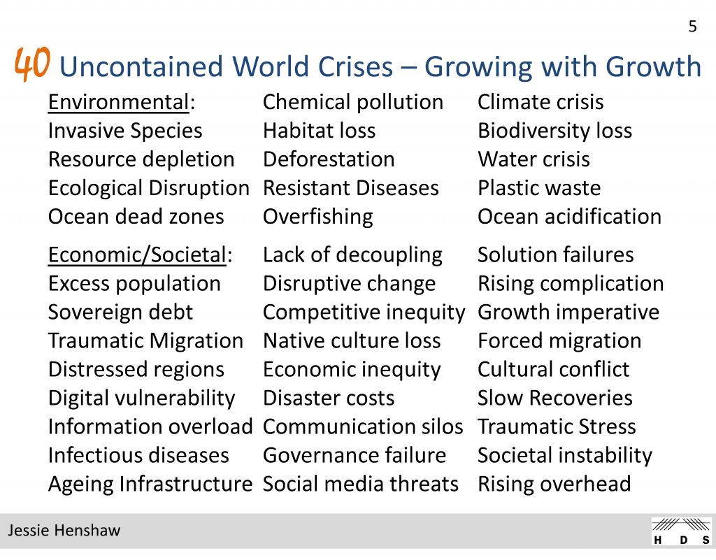
In part, we experience that as universal pressure, for increased economic performance from all people, all organizations, all societies, and of course, all of nature too. We are also feel surrounded by systems failing to keep up, and in crisis, crying for help, that we find hard to deliver. So today the true location of the most “vulnerable people” and most “vulnerable regions,” struggling with unmanageable demands, is now truly the whole earth. (to cut for time)
At first, the economy’s growing
demands were not overwhelming, and seemed very rewarding for large sectors,
having a negligible impact on the earth as a whole too. Continually multiplying them changed all that. Now they disrupt every environment and are breaking
through all silos of discussion. Now we
see there was no “economic decoupling,” but just detachment from our responsibility. Now we look around and see an enormous diversity
of crises that were not supposed to materialize, and need to decide what to do.
We need an “economic recoupling” with our responsibilities
for the earth and humankind. An easy
first step is to think of your responsibility for steering the economy as equal
to your share of the economy. It may
seem small, but in a global economy where it takes the whole world to deliver
every product or service, we are similarly responsible for a share of every
harm caused too.
Nature’s integral: joining the multiplication of parts (red) with the refinement of their designs and uses (blue) to prepare for LIFE (green) as the reward in the end
The path ahead I see, for transforming
the economy is to change from compound
growth to natural growth, climaxing growth at a peak of resilience and vitality,
ready for a secure, enduring and creative life on earth.
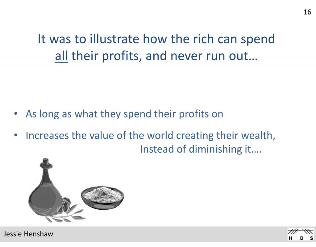
“Finance Serving Life” introduces an updated version of the transformation journey for global capitalism envisioned by J.M. Keynes. He first described it with a biblical fable he called “The widows cruse” (or “Widow’s cup”) based on the 1 Kings 17 story of Elijah asking for food from a poor widow with scarcely any, just a last bowl of flour and flask of oil. To relieve the poor widow of doubt Elijah tells her that if she shares her scarce provisions it will provide generously for both of them, becoming inexhaustible as long as she is in need.
Keynes’ use of the fable was meant illustrate to the wealthy that if growth ever became unprofitable, they could sustain a healthy economy by spending rather than compounding their profits, and have their profits forever be return to them. It illustrates a true natural economic principle of sustainability, that at natural limits to growth spending the profits from investments will become necessary to keep them profitable. That principle is also observed in living systems that repurpose their surpluses at their limits to growth, from being used for multiplying their parts to perfecting their uses and designs in order to thrive at maturity.
Today we can observe that using profits to continue to multiply the parts and demands of the economy on the earth and humanity have become excessive, in total effect impoverishing rather than enriching the both the human and natural world. In principle, though also depending on how it is done, relieving nature and humanity of escalating demands for increased productivity by wisely spending, rather than reinvesting profits would assure that the same level of profits would become everlasting.
Philanthropy and sustainability are among many such good purposes that those with a “good eye for value” might choose at a time such as the present when compounding profits to multiply the parts and scale of the world economy has become increasingly unsustainable. In macro-economic terms, spending the profits of the economy as it approaches the natural limits of healthy development relieves the natural world from endlessly increasing extractive depletion and disruption, while repurposing the use of profits for perfecting the economy’s systems and their relationships with the natural world, potentially bringing endless vitality to the whole.
One of the fine points observers often miss is that a non-growing world economy, using its profits for perfecting its designs for thriving and caring for the planet, would not become a stagnant “cash-cow.” Like a natural ecosystem it could be a thriving and stable system for continual self-reinvention, maintaining as much creative change, i.e. “creative destruction,” as is comfortable. Maintaining that balance of healthy creativity, avoiding both rapacious growth and stagnation, is then the steering job of the transformed economic system.
People are such wonderful designers of systems they put their minds to, and life offers so very many wonderful examples of successful transitions of this kind, from compound extractive growth to long lived creative stability, it is hoped that now that we are faced with the challenge, we could put our minds to it and figure it out.
The current slide set for presenting the concept more fully as a talk or webinar has the same name “Finance serving Life.”
— A presently elevated growth rate of CO2 in the atmosphere directly linked to globalization.
— And resulting likely 1.5 degree C warming by 2030, TEN years earlier than the recent IPCC estimate.
— Plus a fascinating story of diagnostic data science discovery.
Yes, it is a somewhat radical approach, but is fully data driven, meticulous, and at the high side of the IPCC uncertainties, making it plausible. So it should challenge others to try to confirm or dispute the findings. Losing 10 years in preparing for 1.5 degrees C also makes this finding, if true, extremely urgent to respond to.
(A Major Edit of a 10/8/18 version, republished 4/8/19 – Jessie Henshaw)
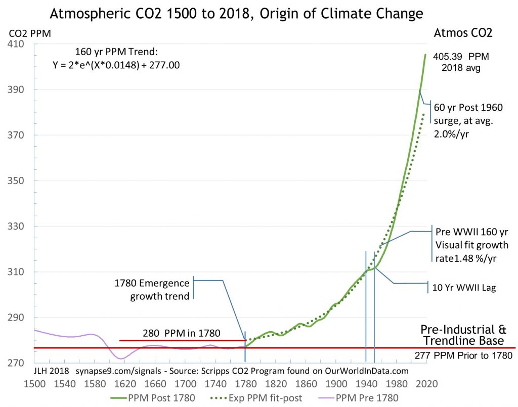
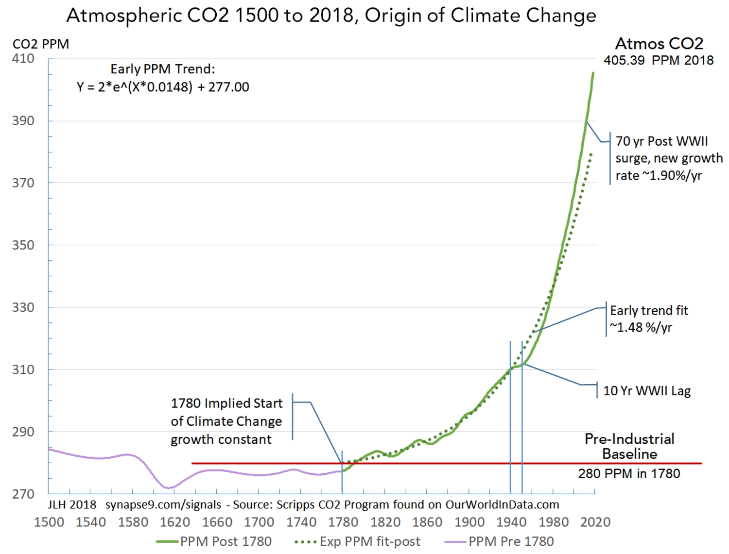
The Path of Atmospheric CO2 – To understand climate change it helps to start with the whole picture, the great sweep of increasing concentration of CO2 in the atmosphere shown in Figure 1, as the main cause of the greenhouse effect. Looking at where it began, you can clearly see the fairly abrupt shift in the trends at about 1780, also about the same time as rapid industrial growth was beginning, seeming to mark the abrupt emergence of fossil fuel industry that the rest of the curve clearly represents.
Look closely at the relatively lazy shapes of pre 1780 variation in CO2 back to 1500 (purple) and how that pattern differs from the abrupt start of the growing rates of increase (green line) after 1780 an how closely it follows the mathematical average growth rate curve (dotted). Note how the trendline threads through the fluctuations in the data starting from 1780. The way the data moves back and forth *centered on the constant growth curve* is what implies that the organization of the economy for using fossil fuels had an constant growth rate, of 1.48 %/yr. Hopefully that seems rather remarkable to you, but the data is clear, that the global economy has a single organization for behaving as a whole, as a natural system, with a stable state of self-organization in that period.
Figure 1 – The abrupt emergence of climate change with the industrial economy, evident in the constant compound growth of atmospheric CO2 PPM at 1.48 %/yr, from 1780 to WWII, followed by a pause and then the transition to the even higher growth rate 1.90 %/yr, That second growth spurt, continuing to the present, presumably reflect the modern reorganization of the world economy for maximum growth informally called “globalization.”
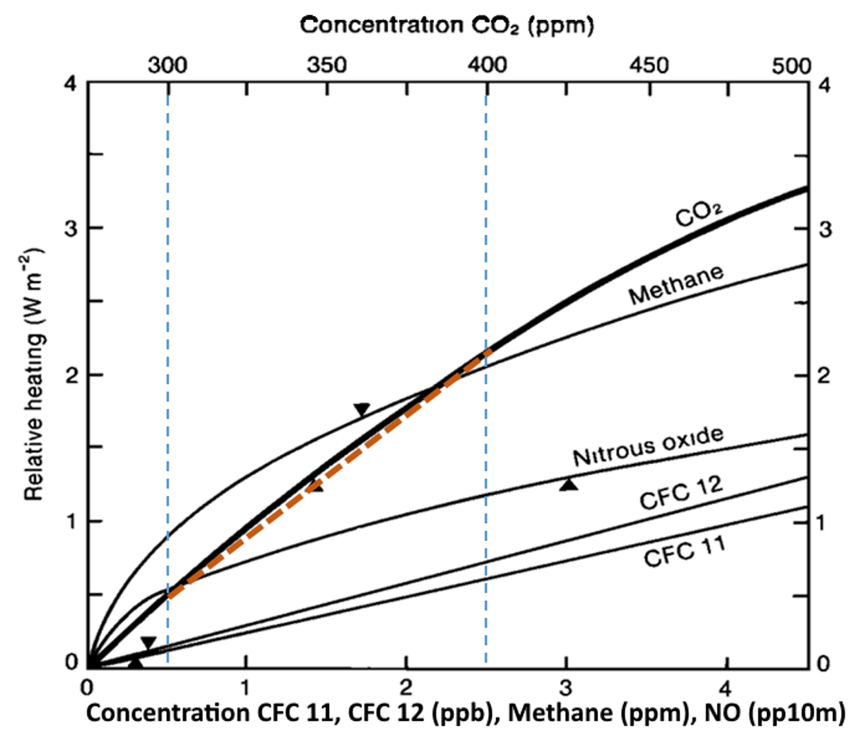
We know from the absorption of heat radiation by CO2, creating the greenhouse effect, that the CO2 greenhouse effect is heating the earth in relation to its concentration in the atmosphere. What implies that relation is close to linear, making the effect directly proportional to the cause, is shown in the Figure 2. The dashed brown line shows the slope of the relation, closely fitting the actual gradual curve, at least between 300 to 400 PPM, the thresholds that were crossed in 1914 and 2016 respectively, a period of 102 years. Atmospheric CO2 is increasing much faster now, though, so the next increase of 100 PPM, to 500 PPM, will be reached much more quickly rising at its current stable rate of 1.9 %/yr rate. If that rate continues 500 PPM will be reached in only 30 more years, by 2046. That large acceleration is the effect of the current higher exponential rate of increase. Of course, considering the rapid compound acceleration of the cause of climate change, and the alarm people are taking now, quite a lot could happen before 2046.
Figure 2 – The “relative heating” of the the earth to Atmospheric CO2 concentration, indicating temperature change has an approximately linear relation to CO2 (brown line) for the range of concentrations (300 to 400 PPM) over recent times. The triangles indicate concentrations in 1985. (Mitchell 1989, Figure 6 w/ added color)
The Annual PPM Growth Rates – Figure 3 shows the growth of Atmospheric CO2 (green) with the details of its fluctuating annual growth rates, to depict both the constants of the growth curve and it’s irregular growth rate interruptions. The individual interruptions raise lots of interesting questions, but perhaps the most important feature is that they are quiet temporary, as evidence of the constant behavior recovering again and again.
The upper curve shows fluctuating annual growth rates (lt. axis, PPM dy/Y) for the curve below, the CO2 PPM concentrations. The peaks and drops of the growth rate align with the small waves in the concentration (rt. axis). Note that the large drops in the growth rate that seem to snap right back to the the horizontal dashed red lines. That seems to show that they mark processes that absorb and then release CO2 again, as they do not seem to affect the average growth rates of PPM concentrations as a whole, around which the annual fluctuations homeostatically fluctuate.
This diagnostic approach is for raising questions like the above, using the annual growth rate to expose the dynamics of the curve for a somewhat anatomical picture. In this case it’s of the homing dynamics of the global growth system as it first hovers around the rate 1.48 %/yr from 1780 up to WWII, and then shifts to hovering around the higher rate of 1.9 %/yr as it stabilizes from 1971 to 2018. You might think of these two long periods of homeostatic growth rates in CO2 concentration as representing periods of regularity in the causal systems, global economic growth and the carbon cycle response, seen through the lens of atmospheric CO2.
You might think the large departures from the regular trends would be great recessions perhaps, that then “make up for lost time” on recovery. I could not find corresponding recessions, though, and for the great recessions I checked there do not seem to be notable dips in CO2 accumulation. To validate this kind of research one has to go through that kind of thought process for every bump on the curve, either a tedious or exciting hunt for plausible causes than then check out with other data.
What seems most unusual about the big dips in the CO2 growth rate (D1, 2, 3, 4, 5) is that 1) they do not occur after WWII and 2) they rise and fall so sharply and have no lasting effect, seemingly temperature sensitive as well as absorbing CO2 later released. I can’t say whether it is feasible or not, but something like vast ocean plankton blooms might have that effect, absorbing and then releasing large amounts of CO2. There’s also a chance the way the raw data was splined and the growth rates smoothed, to turn irregularly spaced measures into smooth curves, might also have unexpected effects. Whatever phenomenon causing the big dips was, it appears to have been interrupted by the rapid acceleration of warming that followed WWII, as evident in the smooth and uninterrupted rise in most recent and best raw data. Those are at least pieces of the puzzle that might help someone else narrow it down.
Figure 3. Atmospheric CO2 concentration (CO2 PPM)(rt. scale) and its annual growth rates (PPM %/yr)(lt. scale), showing the change in growth constants before and after WWII. The key evidence of these being different organizational states of the world economy (before & after WWII) is regular “homeostatic” (home seeking) reversal of trends departing from the growth constants. It is the post WWII growth constant state of 1.90 %/yr that is preventing normal policy process from intervening in climate change, and needs to be “recentered” on learning from nature rather than overwhelming nature for our survival.
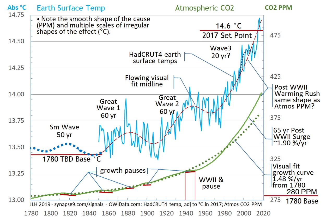
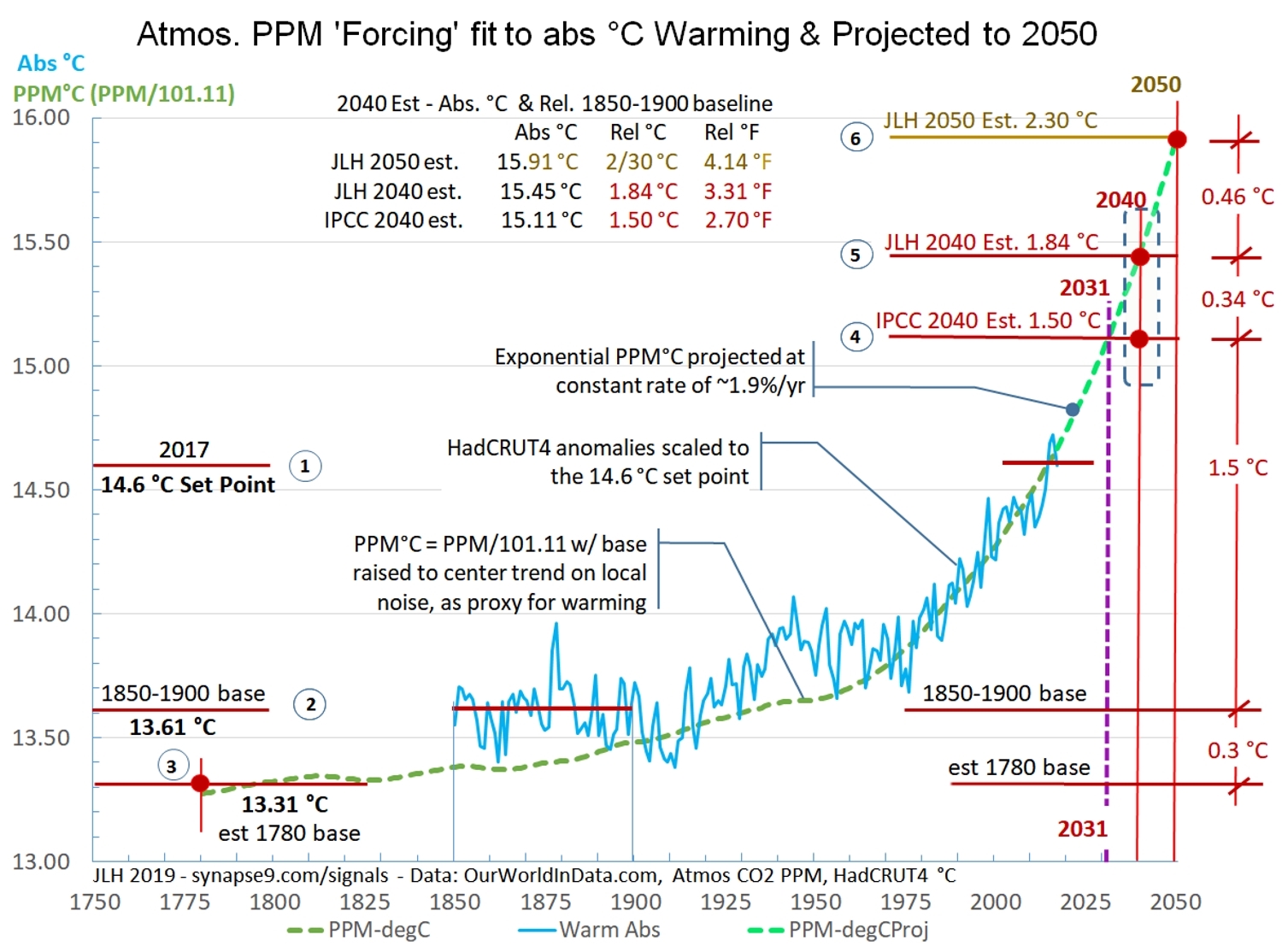
Comparing the CO2 cause and degree C effect – The main purpose of Figure 4 is to compare the history of earth temperatures (blue, ‘C, lt scale) with the curve of atmospheric CO2 (green, PPM, rt scale). The CO2 PPM data is the same Scripps atmospheric CO2 data and scale we’ve seen below. The temperature data is from the HadCRUT4 records used by the IPCC. In this case the original anomaly data relative to the 1850-1900 average have been converted to absolute ‘C values, using a conditional set point of 14.6 ‘C in 2017. In a way it is as arbitrary a coordinating value as the others people use. It’s chosen here first for being a more familiar scale, but also so that 1780 initial values for PPM and ‘C can be determined as initial values for the greenhouse effect. Those baselines are essential for defining the exponential growth rates of the PPM and ‘C curves. The 14.6 ‘C value was based on an expert’s estimate.
Figure 4
Aligning the curves for Figure 4 lets us look closely to see if any shapes of the cause of the greenhouse effect (PPM) are clearly visible in the shape of the effect, global warming (‘C). Does anything in particular jump out? First might be the differences, one curve quite smooth the other jittery, both having wavy fluctuation patterns too, but of very different scales and periods. The first thing you might ask about is how regularly irregular the ‘C curve is seems to be. That variation is thought to be mostly due to annually shifting ocean currents, along with weather system changes and the difficulty of measuring the temperature of a complex varying world.
The ‘C curve (Figure 4) also shows the two ‘Great waves’ (#1 and #2) in earth temperature that appear to be independent of the greenhouse effect. The dotted red line was visually interpolated as the midline of the irregular but seemingly quite constant fluctuating annual temperatures of the HadCRUT4 data. The blue dotted line was added to suggest earlier large waves in earth temperature copied from the shapes in the ancient temperature reconstructions seen in Figure 5. I physically overlaid those reconstructions of ancient temperatures on Figure 4, drawing a continuation of the Figure 4 midline curve that fit the Figure 5 curves.
One might say the minima of the great waves in the ‘C curve display a trend somewhat like the general trend of the PPM curve, say from 1780 to 1980. The one shape that makes the two curves seem really connected, though, is the way the sharply rising PPM curve (the implied cause) and ‘C curve (the implied response) both start following a “hockey stick shape” in the 1980s. It even seems the shape of the ‘C curve interrupts the great waves as it takes off exponentially, breaking a rhythm that seems to go back many centuries. There is a possibility that the great waves represent upper atmosphere standing convection patterns waxing and waning, something that increasing convection intensity could interrupt. Perhaps that would help others find what the great wave cycle, or not. Since theory suggests the trends of both cause and effect have a linear component Figure 6 shows a linear scaling of the PPM curve to see if it and the ‘C curve can fit.
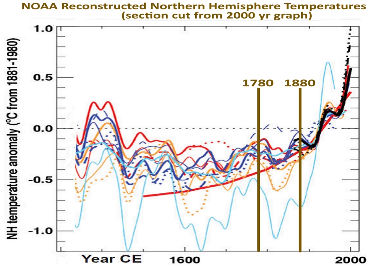
Figure 5 – NOAA (2007) 1300 to 2007 Northern Hemisphere record of temperature reconstructions. Measured from a 1881-1980 baseline. This it taken from a longer history keeping the units and adding a title and dates 1780 and 1880 (brown). That is the period after the greenhouse effect began before it was visible in the records of earth temperature. The red line shows an old NOAA speculation that warming developed earlier and slower than found here.
Scaling CO2 PPM to Make a ‘C Proxy – The reason to scale PPM to emulate the dynamics of ‘C curve is simple. The ‘C fluctuation is so erratic the variety of curves to predict its future is rather extreme, so people have been generally using a straight line. An exponential curve is not a straight line, though. So the quite regular shapes of the PPM curve, including its clearly measurable growth constants, 1.48 % before and 1.9% currently, do make it a prime candidate as a useful proxy. Even if the trend has a clear direction now we of course have to allow for increasing uncertainty over time. Adding to that are the plans for dramatically cutting CO2 despite a world economy dramatically increasing its production, a tug of war that could be interrupted by actual war or other economic downturn.
Where the current stable growth rate of climate change seems headed, knowing the PPM curve should be linearly proportional to the greenhouse effect, we experimentally scale CO2 PPM see if it fits the ‘C curve in a logical way (Figure 6).
Scaling the PPM curve to fit the ‘C curve makes a PPM’C proxycurve, hoping to fit the midline of the highly irregular ‘C curve from 1980 to the present. Both the units and the baseline are not determined, though, to produce the proxy curve in PPM’C = A*PPM + B, using a linear scale factor A and a baseline B. A third determinant is then finding a optimal fit between the very different earlier shapes of the curves. So basically I tried lots of things, and found my initial assumptions were mostly wrong. Initially I made the mistake of trying to fit the PPM’C curve to the midline of the earlier ‘Great waves’, and tried several ways until it was clear they were all wrong.
Then I realized those earlier great waves were really not related to the greenhouse effect. So my greenhouse effect projection might better be interpreted as coming up under the earlier systems, like it actually looks. That was purely a graphic device at first. Then when I adjusted the PPM’C curve to pass under the ‘Great Waves’ I set it to go through the miline of local fluctuations instead of the Great Wave departures. Suddenly the fit of rapid growth period became as perfect as I could ask for. I spent some time trying to figure out why, studying all the loose ends, in the end resolving that’s what the data seemed to say. That PPM’C curve then becomes the hypothesized most likely “real” rate of greenhouse effect climate change, and offering a much more narrowly regulated way for projecting its future.
Figure 5 shows both the best fit scaling of the PPM’C proxy curve (dark green dashed line), and its extension to 2050 at its presently stable growth rate of 1.90 %/yr (dashed light green line). Yes there are various uncertainties, but the threat of climate change so far has seemed to be from underestimating, not overestimating, and the findings do appear to be well within the IPCC uncertainties given the difficulty of projecting the temperature data directly.
I think it means that reaching 1.5 ‘C by 2030 is a much more probable estimate of the current trend than reaching 1.5 ‘C by 2040.
Figure 6 – The PPM’C curve scaled to closely fit the HadCRUT4 data and then projected at the homeostatically stabilized growth rate of observed in atmospheric CO2. How long this projection might hold depends on how robust the global natural and economic systems driving the growth rate in atmospheric CO2.
The Economy as a Whole – How great a new threat this acceleration in atmospheric CO2 pollution and its greenhouse effect are seems to rest on just how stubborn the global homeostatic regulating systems observed are. That could really change the climate mitigation picture, and help explain why there has been only negative progress in slowing CO2 pollution. So far is seems to have been neglected, with negotiation over mitigating climate change not seeming to take into account the organizational inertia and persistence of the global economic system as a whole.
Figure 7 shows a group of major indicators of the global economy that were selected for having constant growth rates from 1971 (the earliest data for some) to 2016. The GDP PPP curve in trillions of 2016 dollars is growing the fastest, and each of the other curves was indexed to GDP in 1971 in proportion to their relative growth rates. For example, since total economic energy use is growing at about 2/3 the rate of world GDP that variable was scaled to 2/3 of GDP at 1971. This device displays the steady relation between them called “coupling.” That the same proportionality of the growth curves is constant throughout it indicates each of these curves reflects the behavior of the same system. What seems to cement the view that the global economic system appears to be behaving as a whole is the visual evidence that the data of each of these series, like the CO2 PPM data we discussed at length before, seems to fluctuate homeostatically about the growth constant.
What physically coordinates the economy’s coordinated relationships between different sectors displayed here as growth constants seems likely to be cultural constants of each cultural institution, or “silo” of the world economic culture. Every community seems to develop its own expected way for things to work and change and seems to become the way the different sectors end up coordinating their ways of working with each other. That all of this is organized primarily around the use of the exceptionally versatile resource of fossil fuels then indicates that a deeper reorganization of the economy than a swapping of one set of technology for another will be involved. It should suggest to any reader just how very much of the world economy would need to be reorganized, and to be reminded that the last times the world economy was sufficiently disrupted to be reorganized were during WWII an the 1930s.
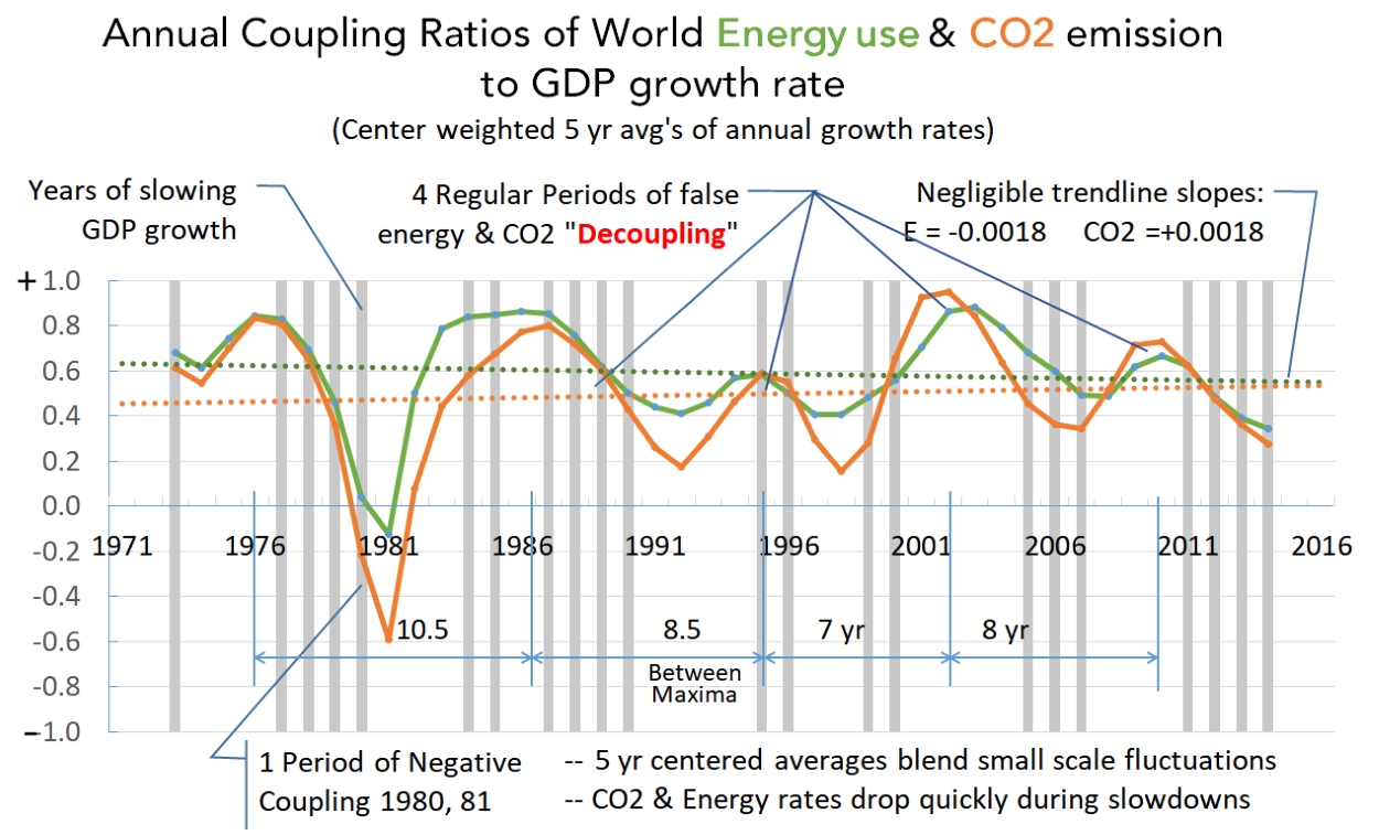
This topic is also the subject of a longer research paper. Science review drafts are likely to be available later in April 2019.
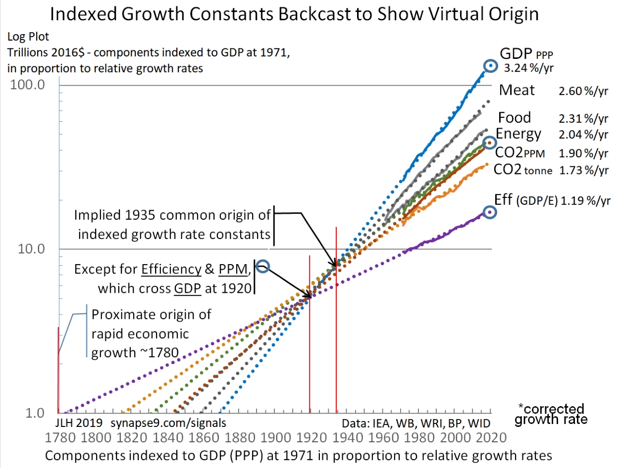
Figure 7. The global economy working remarkably smoothly as a whole system of coordinated parts, seemingly much like theory says it should, but most people don’t see because they don’t look at the behavior of the system as a whole.Figure 8 – Smoothed annual growth rates of recent world energy use and CO2 emissions, showing close coupling of their fluctuations with relatively insignificant trend.Figure 9 – Log Plot of Figure 7 variables with a 1780 to 2020 time scale. The backcasting of their exponential constants displays the convergence with the backcast GDP trend of four of them at ~1935 and with two others (blue circles) at ~1920. The effect implies the stable coordination of the parts of the global economic growth system established by the 1970’s was in the 1920s and 30s.
Work in progress… Below this line is old text that may be edited in pending updates.
It’s a powerful technique for understanding complex systems, such as the world economy, that behave smoothly as a whole. The most important observation is just that. The system as a whole and these whole system indicators are not separate variables, and the smoothness of the curves shows the system as a whole behaving smoothly as a whole over time.
From our local views of the world that often does not seem to be at issue, though it really is the main force behind all the changes everyone is struggling to adapt to. Individual businesses, cities and countries generally have a quite irregular experience, as their roles in the whole continually change. What the smoothness of the curves and the change in the system as a whole really means is that the world economy is working the just the way it is (financially) supposed to. It is being globally competitive the way money managers manage it, and continually reallocating resources and business to where they will be best utilized, resulting in most every part having somewhat irregular experience to make the whole behave smoothly. The uniformity of these global indicators also says is that their origins all point back to ~1780, when modern economic growth began. We have reasonable measures US economic growth from ~1790, …and so went the world!
Smooth exponential curves and the systems generating them are, of course, among the things of nature with inherent “shelf lives”, relying on systems of developing organization of multiplying scale and complexity, certain to cross thresholds of transformative change. In nature, growth systems generally develop to one of two kinds of transformation, stabilization or destabilization, the crashing of a wave that doesn’t last for example or the thriving business that can last for generations. What characterizes the difference for the emerging systems that last is that, while becoming strong with compound growth (like the systems that don’t last also do), they become responsive and refine their systems to stay strong. In economic terms that’s remaining profit seeking they “internalize their externalities” to mature toward a peak of vitality rather then failure. It’s a choice made in mid-stream.
Understanding what will make that difference in outcome for our global growth system will partly come from people getting a better understanding of how we got here, as shown in the Figures 1, 2, 3 & 4. The growth of technological civilization relies on ambition, creativity and resources, and methods that we could potentially change. How economic growth is largely managed by the application of business profits to multiplying business developments, what makes GDP to grow. If our decisions were to internalize our externalities that is also one of the things that might change, without really changing human ambitions, creativity or resources.
__________________________
JLH
New systems science, how to care for natural uncontrolled systems in context