There’s a now famous study of progress in human welfare, with a common glaring flaw.
The flaw interestingly betrays how humans are dazzled by positive information, and quite forget what we’re looking at.
Hans Rosling has traveled the world, presented at the TED talks many times and raised huge amounts of money for his work, based on the beautiful data animation videos he has produced, like the one on world progress in human welfare over the past two centuries.
It displays the remarkable course of human progress, as proof positive of the soundness of the capitalist approach to economic development and the universal value of creating wealth for all that is evident in the data. It is indeed a remarkable history.

The animated evidence of steady global improvement seems so convincing in the light of the generally pessimistic character of debate over the future of the global environment and human welfare, it’s just overwhelming for many people. Presented with such an affirmative contrarian story about the collective will of mankind, essentially, it becomes all to easy to forget what one is looking at.
What we’re looking at is the behavior of the world economy over the past two centuries, not the future. It shows the record of our being able to consume the resources and cause environmental impacts increasing in scale at compound accelerating rates by a factor of about 1000 by doubling roughly every 20 years (1), which has indeed produced continual improvement in human welfare, though at arguably liner rates of progress(2).
The question, then, is whether that is evidence of a secure plan for the future, as it is clearly suggested to be? Or is that the most convincingly misleading use of the data you’ve yet seen?
Note:
1) That the economy has “increasing in scale at compound accelerating rates by a factor of about 1000 by doubling roughly every 20 years” comes directly from the traditional measure for “real growth” as material progress, for GDP increasing at 3.5% per year.
That reflects the average US growth rate since 1880 that seems to have begun around 1800, implying the US economy doubled in size ~10 times during the period of Rosling’s display of human progress. A policy to maximize growth remains the worldwide economic model for the future that everyone discusses.
2) The “arguably linear rates of progress” in human welfare is a conclusion based on the graph displaying a straight line of progress, and not doubling again and again.
3) The doubling rates of use for each individual resource, the scale of environmental impacts, the prices of each resource being exhausted and conflicts generated over scarce supply, all vary considerably, but in proportion to the overall rate pf growth of the economy. How the world markets are presently responding to demand growing faster than suitable replacements for depleating resources can be found is the subject of my 4/30/11 blog post big news… from Henshaw, Grantham &… the earth
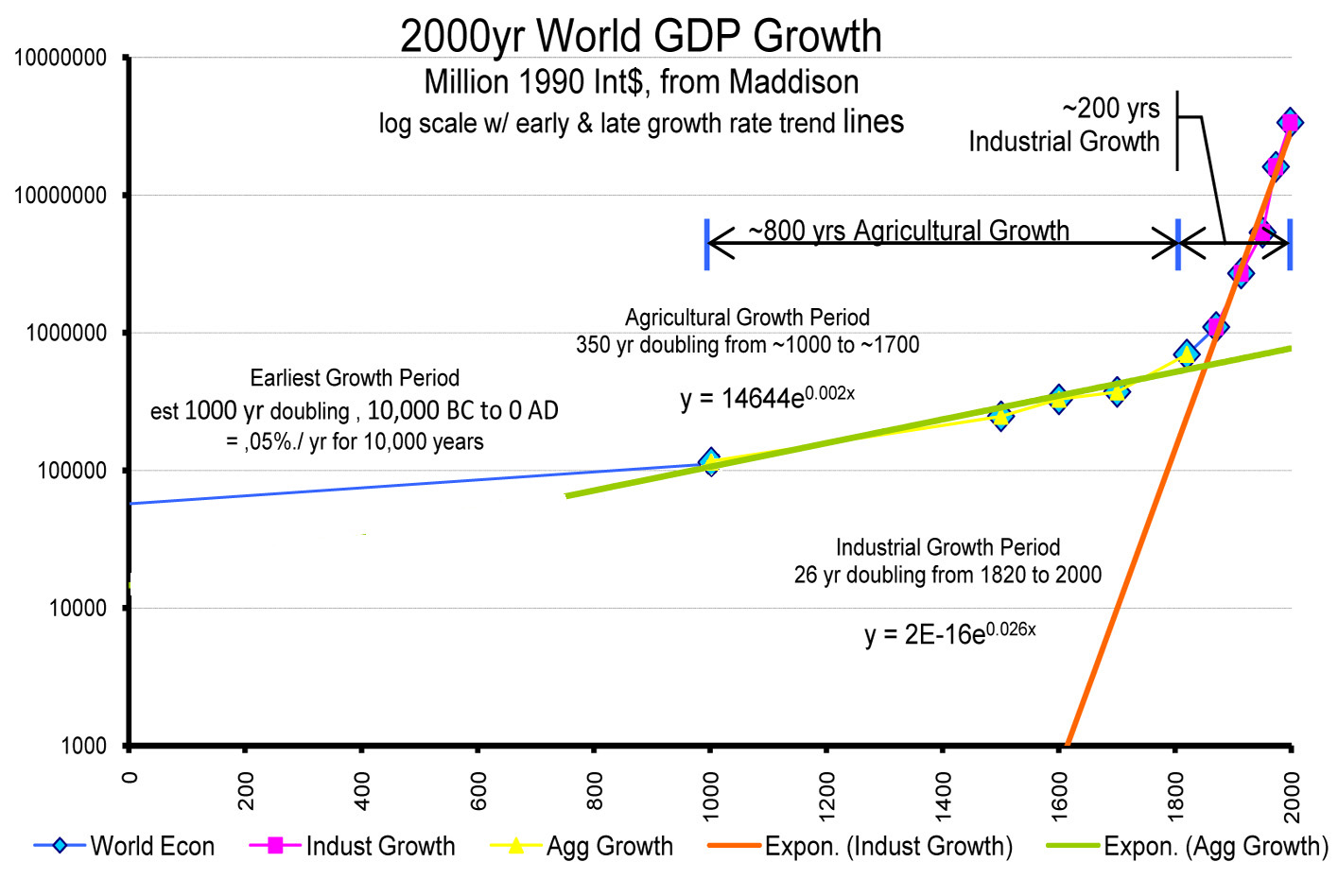
For the graph of historic 2000 yr World GDP Growth, below, Maddison combines various proxy measures, intended to match present day records, showing a growth rate for the world economy since 1820 of about 2.6%. It shows the exponential shape of the trend since 1820 as a straight line on a log plot of GDP over time.