
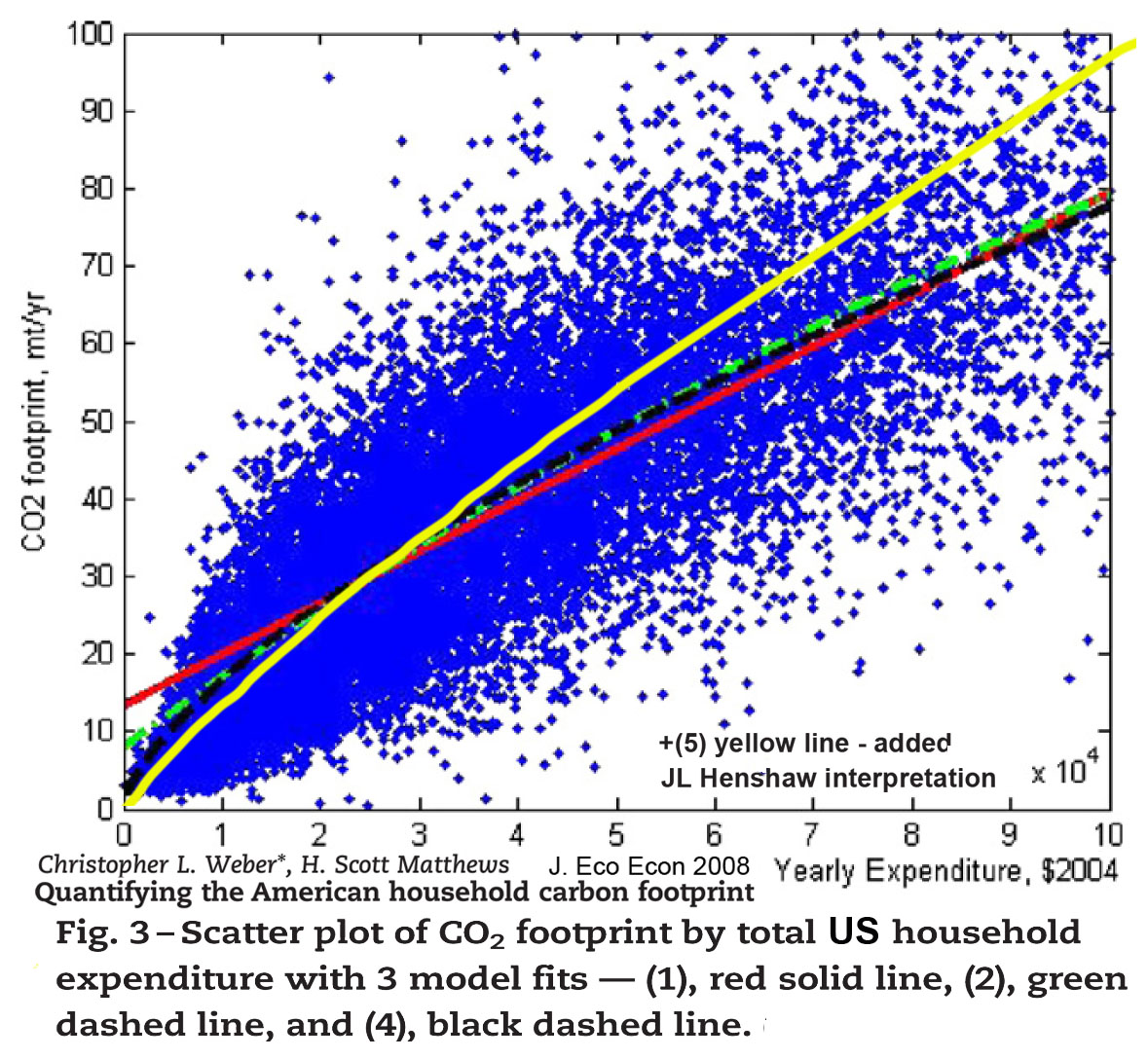
- A “telling” image… connecting dots: the distribution of US household CO2 footprints, by income level from Weber and Mathews 2008
The average Co2 intensity is shown as ~1.0 kg CO2/$1 of income (the scales go to 100 tonne/yr CO2 and $100,000/yr income). That’s about twice the world average CO2 intensity, which was closer to = ~ 0.45 kg/$ GDP in 2004, (declining at 1.24%/yr historically). What it does nicely is confirm one of my most contentious conclusions from the Systems Energy Assessment (SEA) paper and so called “scope-4” assessment. It shows what it means to use average spending, like household “wages” as a baseline measure of average economic consumption impacts. Because the slope of the curve is so different from what I expected I think it remains to be confirmed. The US consumption intensity seems to be about double the world average. It doesn’t seem right but I don’t know what would cause that.
In any case, none of these household impacts being funded by businesses are being counted as impacts of operating businesses by the widely used sustainability metrics! That disclaimer of responsibility seems mostly to be for historical reasons, though, and for the simplicity of accounting for information coming from different places. It also shields business sustainability decisions from having to deal with quite the whole problem at first. Sustainability decisions will later be found to need to deal with it, of course, appearing now to start with a limited task, like a start-up problem, a bike with training wheels.
For the 2010 & 2011 SEA studies of a typical wind farm business plan, we tested what would happen if we were to include this discounted part of the business footprint as having a “world average” CO2/$ intensity. Our including it increased the total measure of energy and CO2 impacts for the business by 400%, as human services actually proved to dominate this seemingly technology centered business. With this new information on the US household impact distribution, I’d now need to say US businesses might actually have footprints 800% larger than presently being counted.
It seems we’re in the middle of quite some learning process! ;-)
fyi..
___________
jlh