A clustering of points could certainly occur at random, but the considerable abnormality of the spikes in the histogram suggest that that may not be the case here. The implication is that these represent either sub-species, that coexist for either short or long periods, or recurrent states of the ecology. It does not seem at all unlikely that a long term evolutionary change would progress in stages, but the evidence here does not seem conclusive.
Work on the puzzle not shown here includes a considerable effort to find any correlation between these groups of points and clustering or other abnormality in the standard deviations of the same samples. The within sample standard deviations of the cluster points appear to be completely normal, neither larger nor smaller than those of the points falling outside the clusters. This suggest that the points within the clustered samples are not clustered within the sample themselves. The distribution of the standard deviations also shows some clustering, but these groups of points do not seem to strongly correlate with the clusters of sizes in the sample means.
The conflicting evidence may be resolvable by some other test, but seems more likely to remain unresolved until the distribution of the individual specimens can be examined, and any significant clusters of individual sizes studied for morphological congruence.
The question, of course, is what does this unusual anomaly represent. A possible hypothesis is that the fundamental diversity of individual differences increased and then decreased during the period of rapid evolutionary change, that there was an increase in the rate and variety of mutations. There is also an appearance is that during this period that change in normal diversity of the population went through continuous progressions itself.
Figure A4 shows a quantile density contour plot which brings out another
key question. Because the quantile contours at the peak are not centered
on the axis, but are islanded on either side, there is an appearance that
there may have been least two divergent strains in the evolving population,
one leading and one following the norm, being alternately sampled, . This
would be consistent with a scenario of species succession in which the
active evolution is occurring in one niche of the species and gradually
infusing others. If this were correct one might expect to see separate
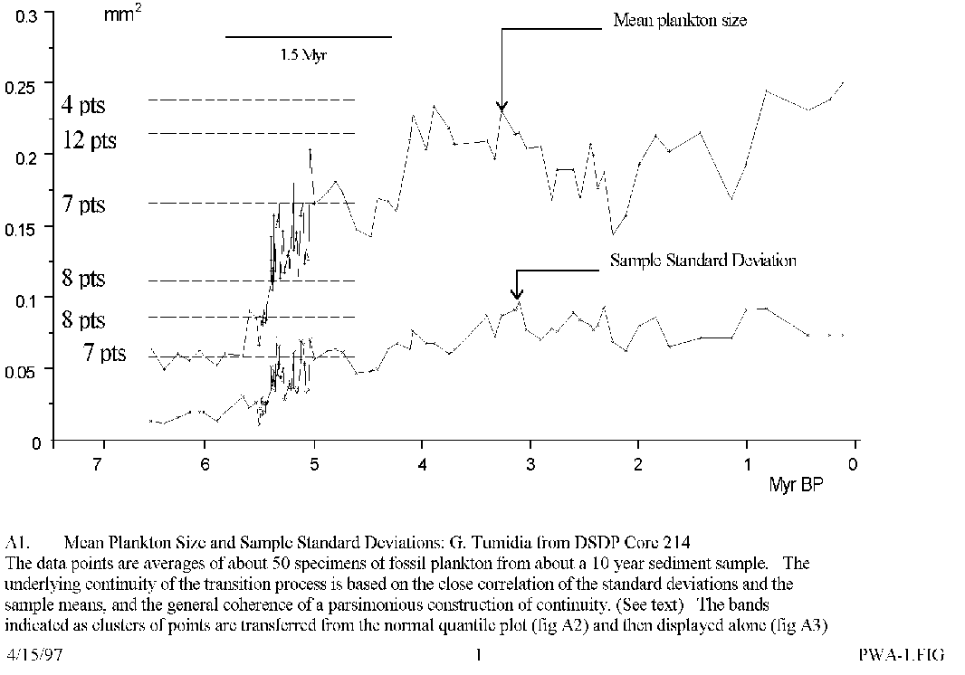
high and low curves in figure A1 , the low one
fading out with fewer and fewer points on its path and the high curve appearing
first less and then more frequently until it is all that is left. That
is not what is seen and so some more complex scenario would seem more likely.